About
I am a Baltimore-based graphic designer specializing in logo design, brand identity, UX/UI, and print and editorial layout.
My strength lies in my expansive lived experience. Having resided from coast to coast, and abroad, I've gotten to experience multiple walks of life. Be it for a local farmer or a corporate executive, my work reflects a range. I don't just change my style on demand, but on the understanding of my clients.
Available for freelance and creative partnerships across Baltimore, the DMV, and remotely worldwide. If you're outside the area, don't hesitate!
Contact

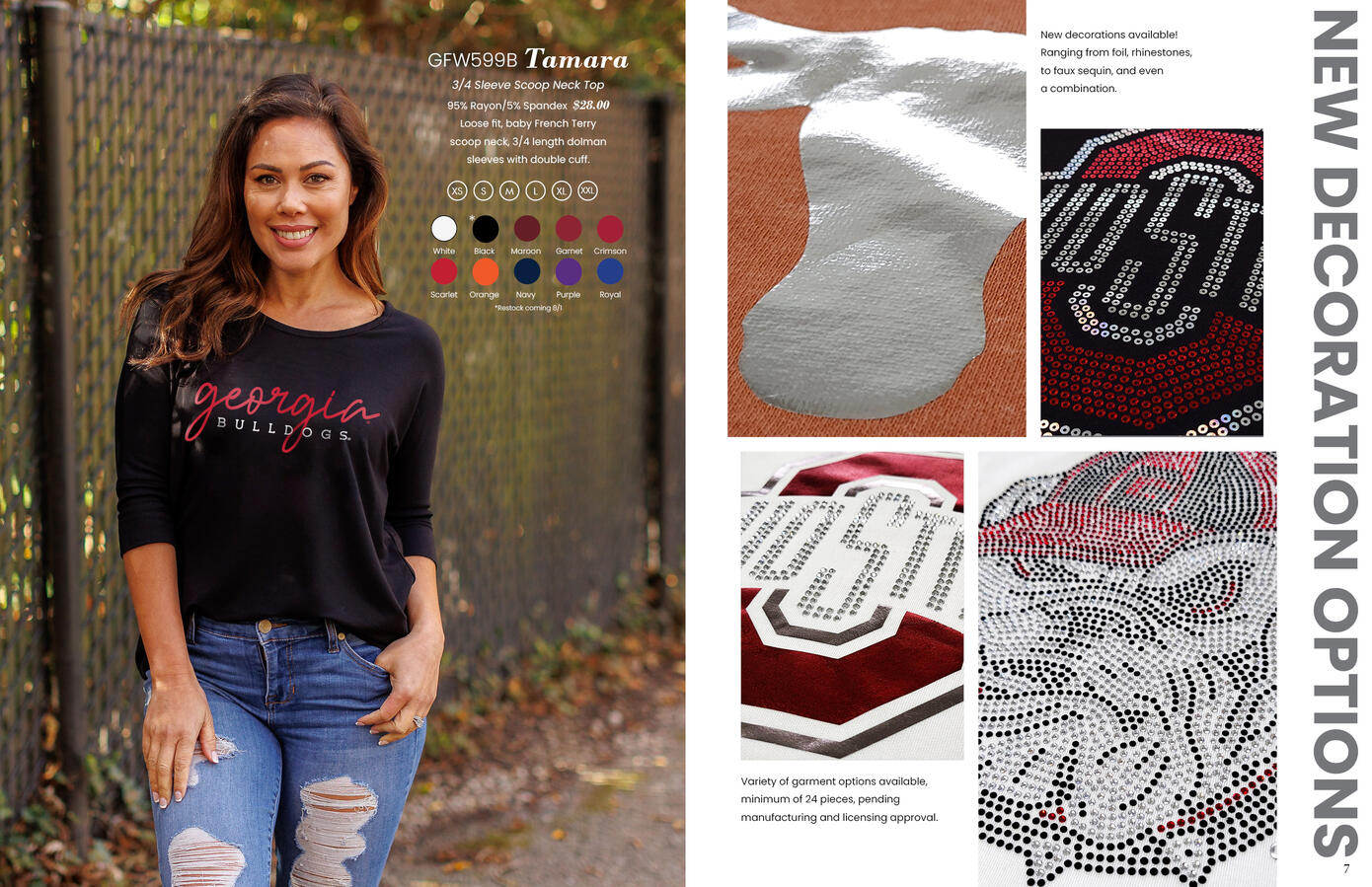
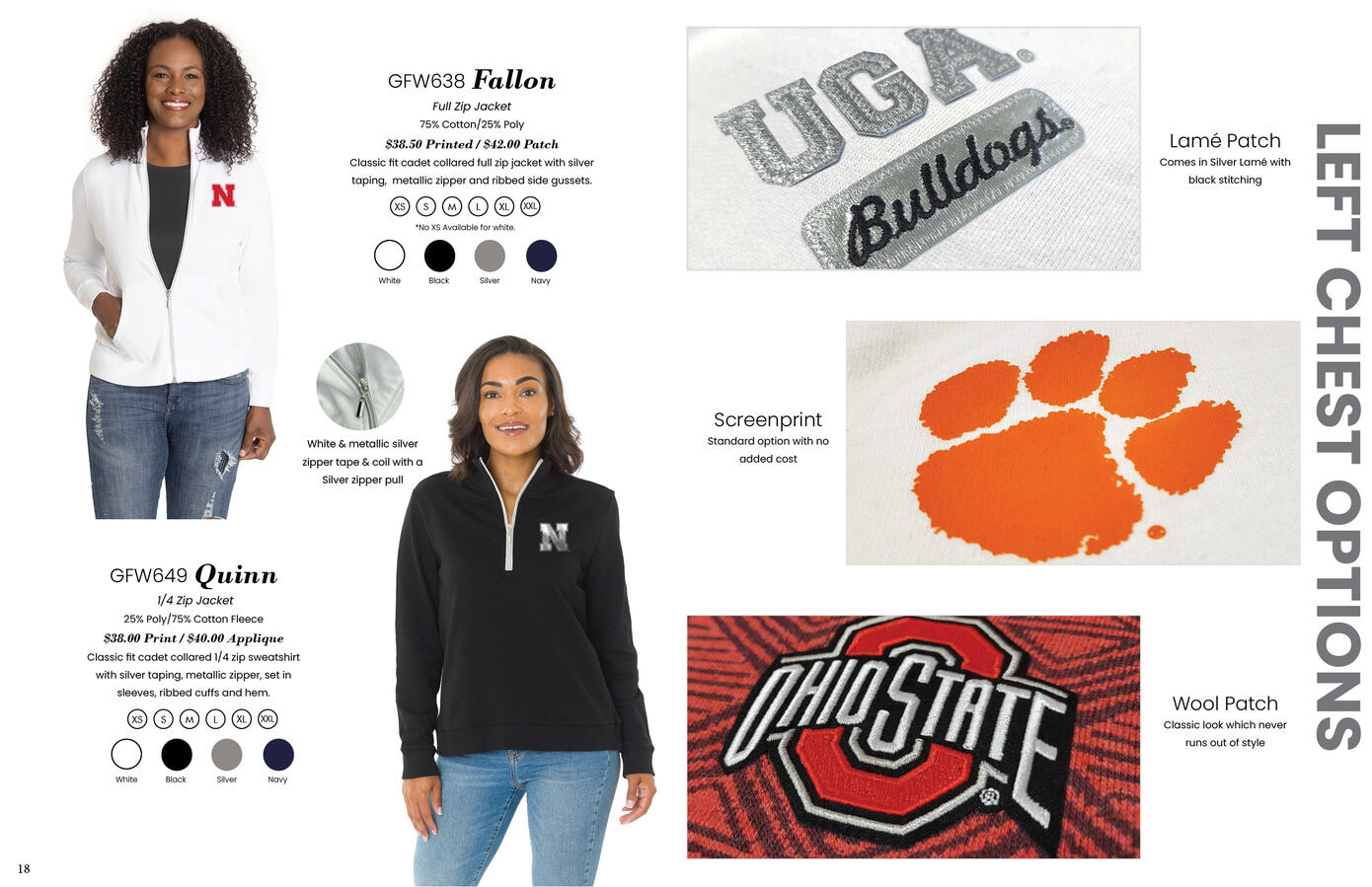
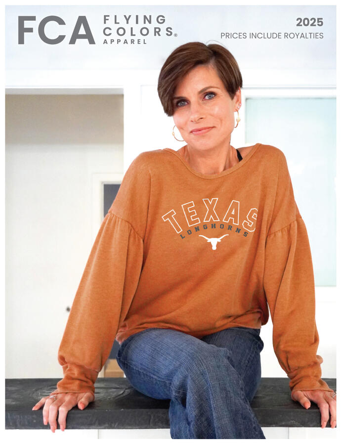
Flying Colors Apparel 2025 Catalog
This was full catalog redesign for Flying Colors Apparel, a licensed collegiate and spirit wear manufacturer. This project involved redesigning the layout system by replacing it with a cleaner, more editorial approach that better highlights the femininity and versatility of the product line. The redesign balances product photography, color swatches, technical specs, and lifestyle imagery into a cohesive spread system that feels modern and retail-ready. Deliverables included multi-page layout design, typography hierarchy, and print-ready production files.


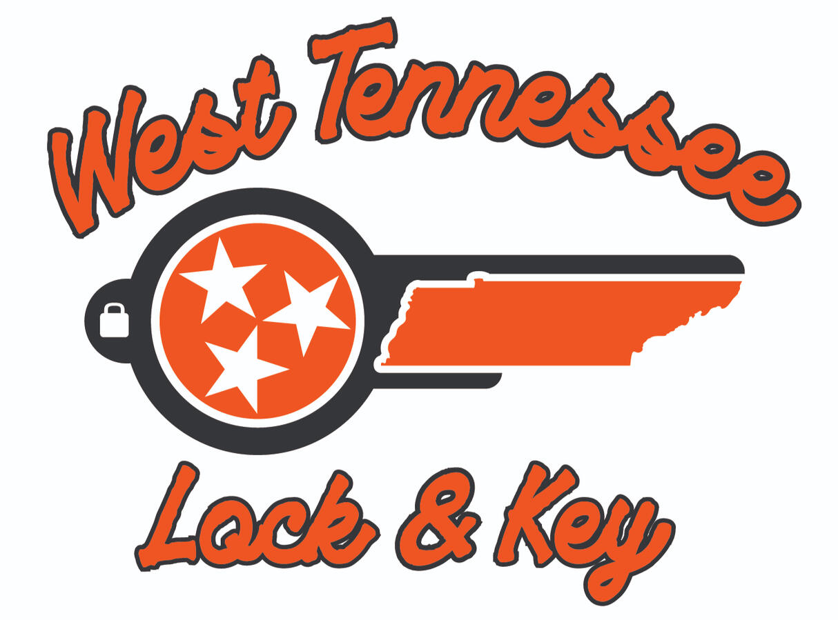
West Tennessee Lock & Key
A logo design for a local locksmithing business with a focus on Tennessee state pride. The mark integrates the state's silhouette as the key blade, with the iconic tri-star symbol in the head. Bold script typography and an orange and charcoal palette draw from classic American small business branding to create a trustworthy, locally rooted identity.

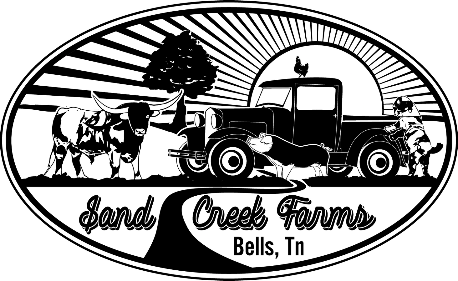
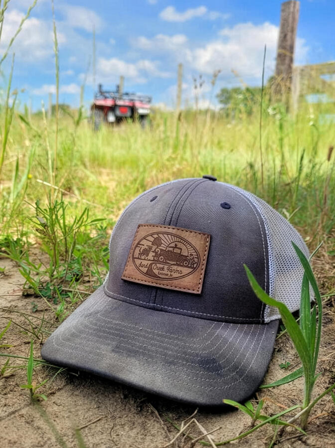
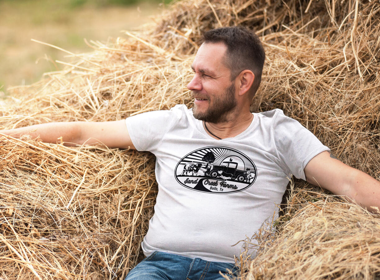
Sand Creek Farms
Designed for a small family-owned farm, this logo was built around the real animals and vehicles on their property. The level of illustrated detail was intentional, as the client wanted something more artful and vintage.
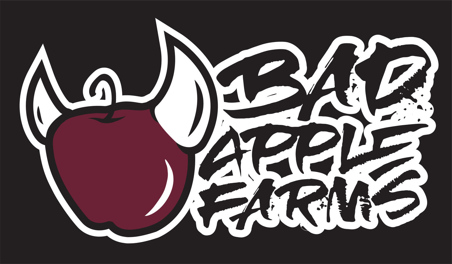
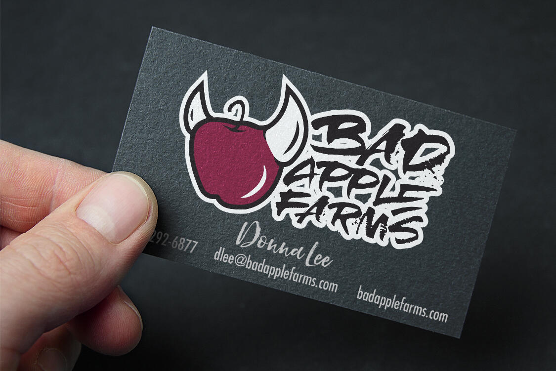
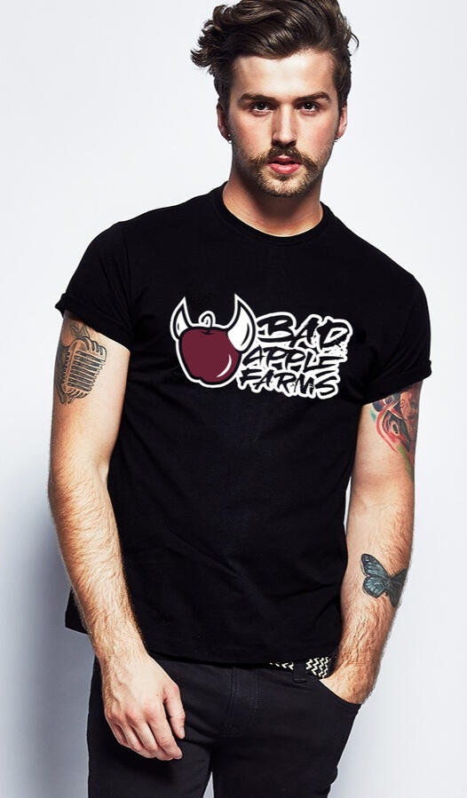
Bad Apple Farms
A logo for a local Baltimore farm that leaned fully into its name. Punk-influenced branding was done to give it an edge that sets it apart from traditional farm aesthetics. The city was beginning an 'Urban Agriculture' program, and this logo was designed to reflect the countercultural spirit of the urban farming movement it was part of.
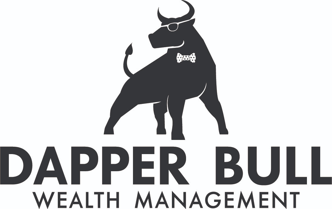
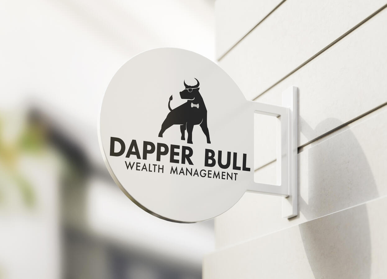
Dapper Bull Wealth Management
This logo was built for a small firm utilizing the classic financial bull symbol, dressed up with glasses and a bow tie to match the clients desired branding. This project was a exercise in balancing my own creative direction with a client's preference for a more conservative, industry-familiar result.
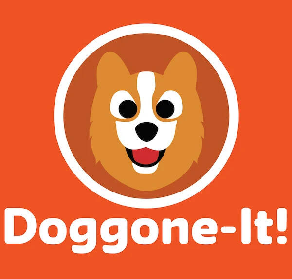
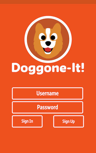
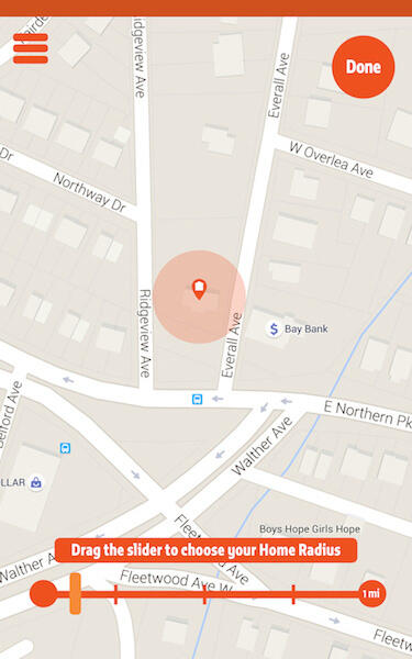
Doggone-It
A UX/UI concept for a pet tracking app designed around the emotional state of its user, someone whose pet is missing. The friendly corgi mascot, rounded typography, and warm orange palette were deliberate choices to provide reassurance during a stressful situation.
Works
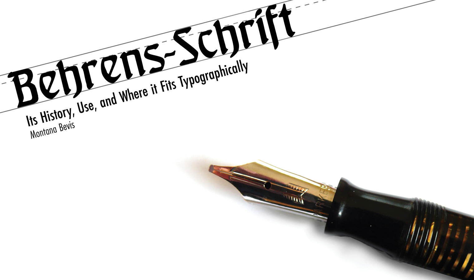
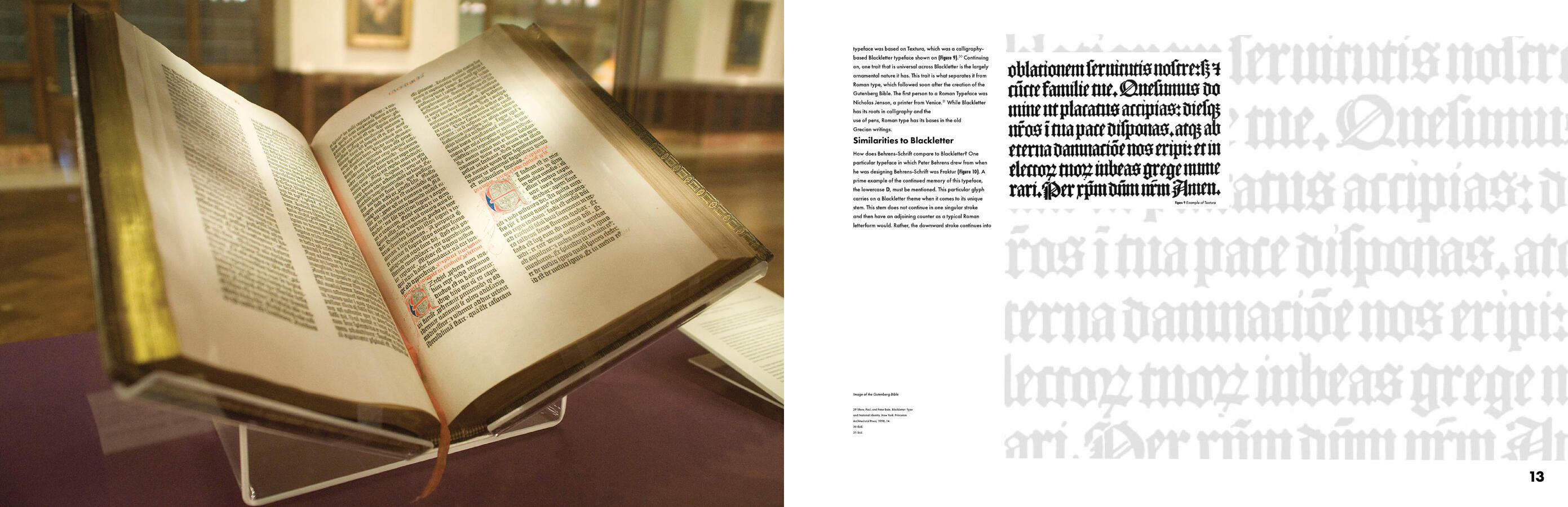
Behrens-Schrift
A self-authored editorial publication researching the history, typographic context, and contemporary applications of Behrens-Schrift, the blackletter typeface designed by Peter Behrens. The layout was designed to reflect the subject matter, using the typeface itself as both a display element and a design tool throughout the spreads. Writing, research, and design were all my own work.
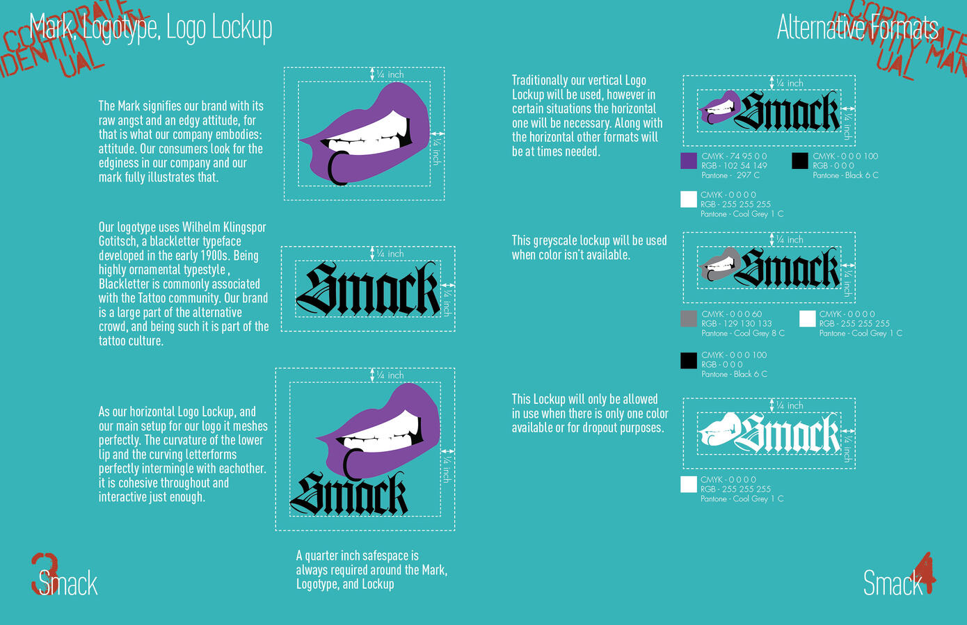
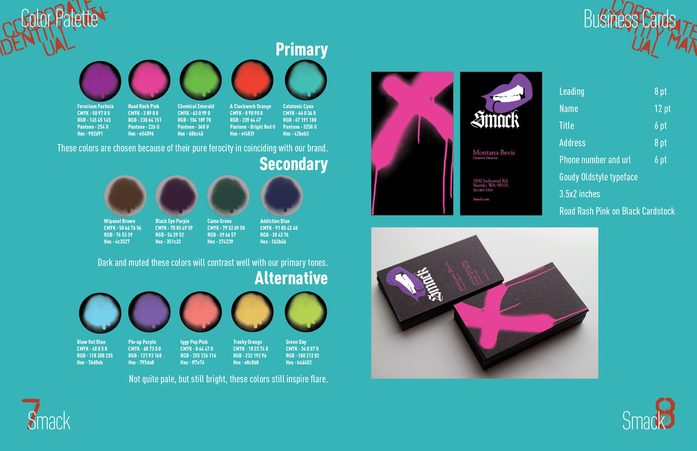
Smack Brand Guide
This is a full brand identity system for a conceptual cosmetics company built around an unapologetically aggressive aesthetic. The project covers color system development, typography, and print collateral including business cards, with every element designed for a gothic aesthetic. The brand palette was developed with named colors that reflect the brand's personality, from Ferocious Fuchsia to Road Rash Pink, treating the color guide itself as a brand touchpoint.
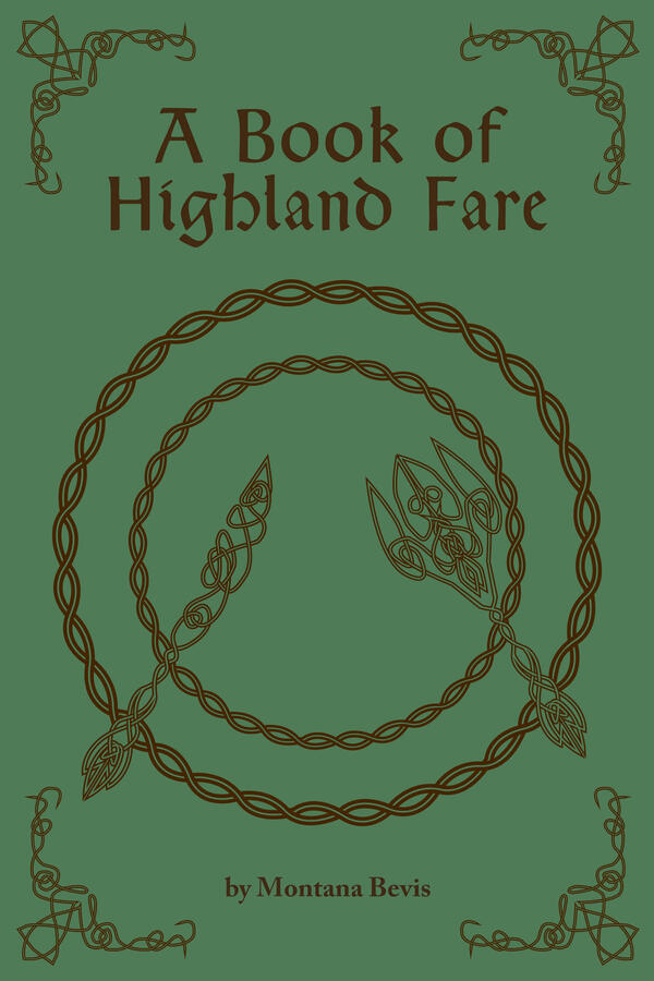
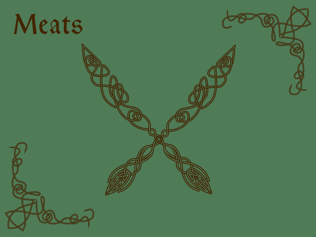
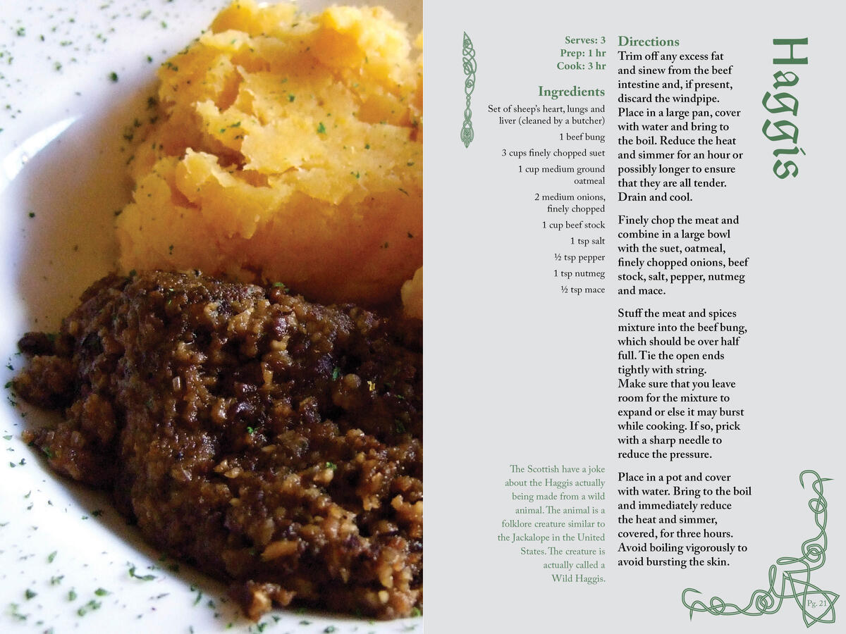
A Book of Highland Fare
A self-researched and designed cookbook exploring traditional Scottish cuisine. The layout balances food photography, recipes, and cultural context, while the cover and decorative elements draw from Celtic knotwork to ground the book visually in its subject matter. Every aspect from content to design was handled by myself.
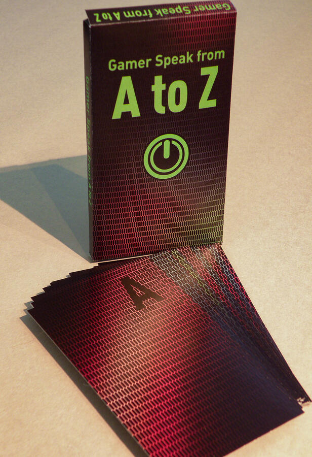
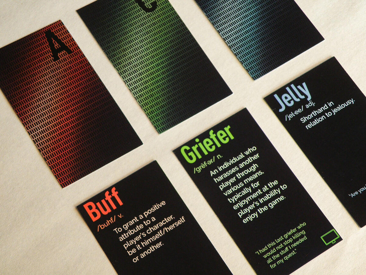
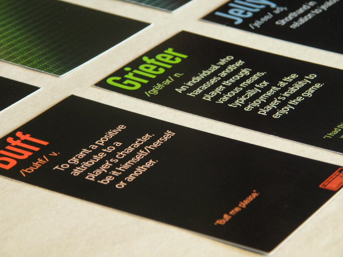
Gamer Speak
A card-based typographic project defining the slang and terminology of online gaming culture. The design draws from the visual language of gaming itself, using RGB color channels and pixel grid textures to give each card an authentic digital feel. A fun exercise in marrying concept and execution.
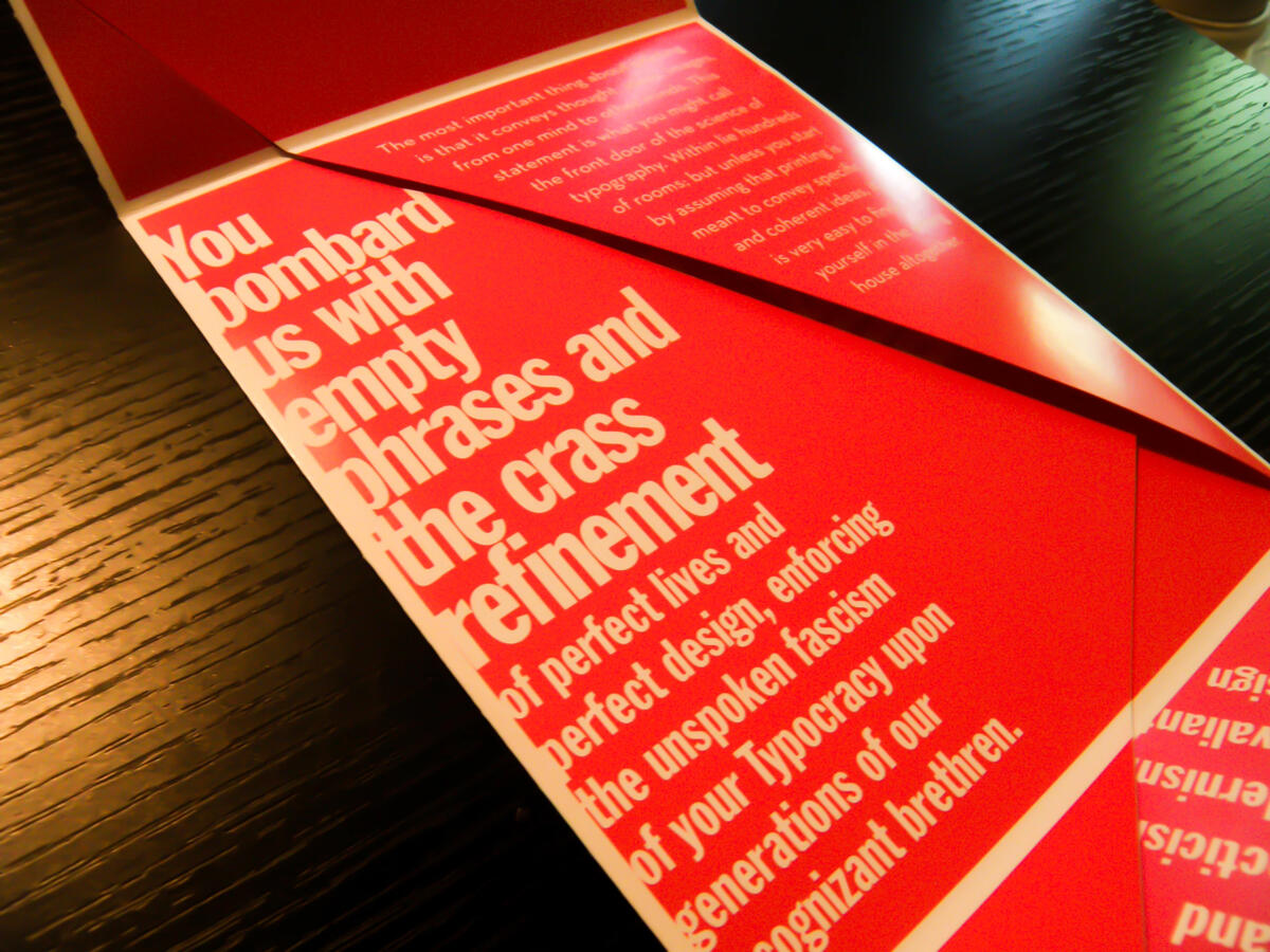
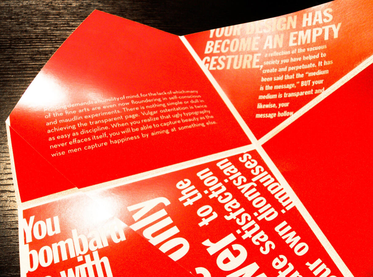
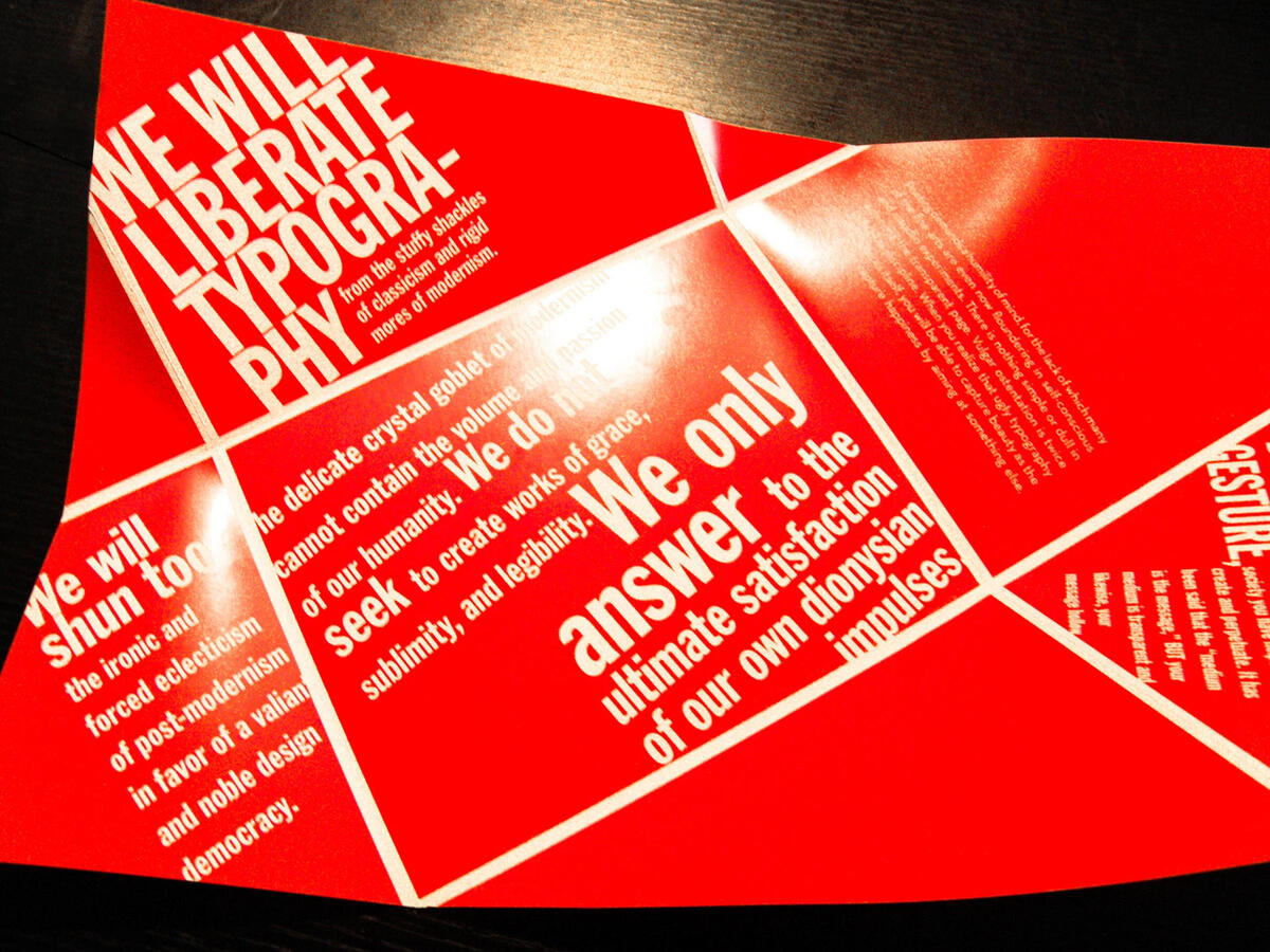
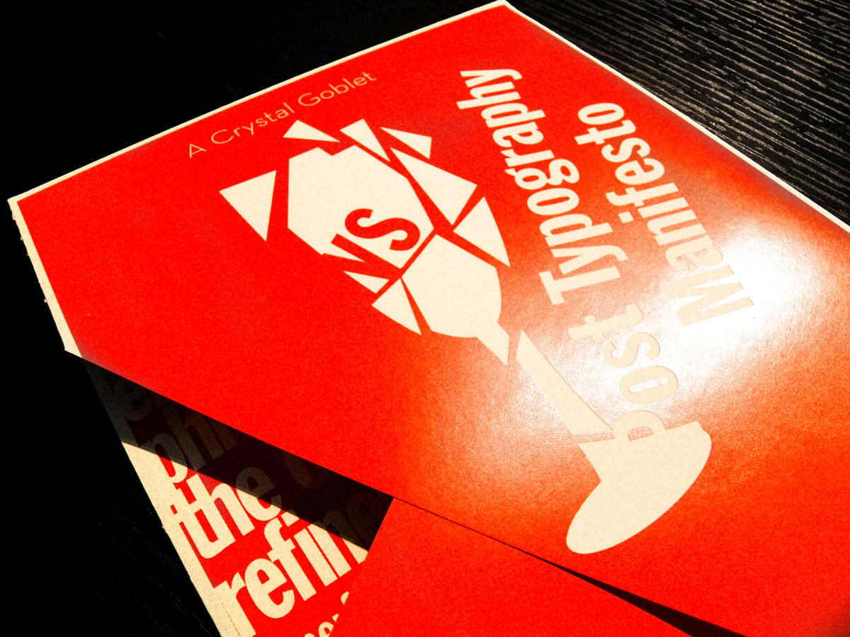
A Crystal Goblet
A typographic pamphlet designed around the ideological clash between Beatrice Warde's "The Crystal Goblet," which argues that typography should be invisible and purely serve content, and the "Post Typography Manifesto", which rejects that restraint entirely. The design intentionally takes a side, using experimental layout, competing hierarchies, and expressive type treatment to embody the manifesto's philosophy.